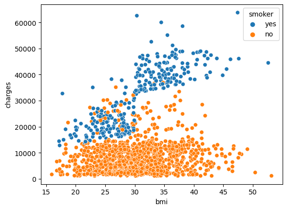
sns.lineplot(data=the_dataset_name). sns stands for an alias of Seaborn library.spotify_data = pd.read_csv(spotify_filepath, index_col="Date", parse_dates=True), it’s good to know that we can consider define a column be the index and parse a column if we have a date data type (imo, this can be a wise data cleaning approach).sns.barplot(x=flight_data.index, y=flight_data['NK']), the x-axis and y-axis needs to be defined. While the Heatmaps, sns.heatmap(data=flight_data, annot=True), similar to the Line chart, with additional annot argument for displaying the value (number) of the data on each cell..index as the x-axis, it can be more flexible (at least by the course) sns.scatterplot(x=insurance_data['bmi'], y=insurance_data['charges'])sns.regplot(x=insurance_data['bmi'], y=insurance_data['charges']), just add the line of code below the scatter plot chart so it can combined together.bmi, charges, and smoker. It applies on sns.scatterplot() to show relationship of 3 variables.
This scatter plot shows that while nonsmokers to tend to pay slightly more with increasing BMI, smokers pay MUCH more.There’s more plot to mention such as sns.lmplot and sns.swarmplot which has different approaches for visualizing data.
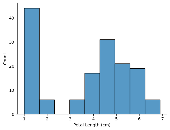
Histogram, is’t same with Bar plot. It uses a range of value on the x-axis which makes the bar-graph doesn’t exactly on the category axis.
Kernel Density Estimate (KDE), is a smoothed histogram
sns.set_style("dark") a command to give a style to our graph/plot. Put or define the code before we make our plot.